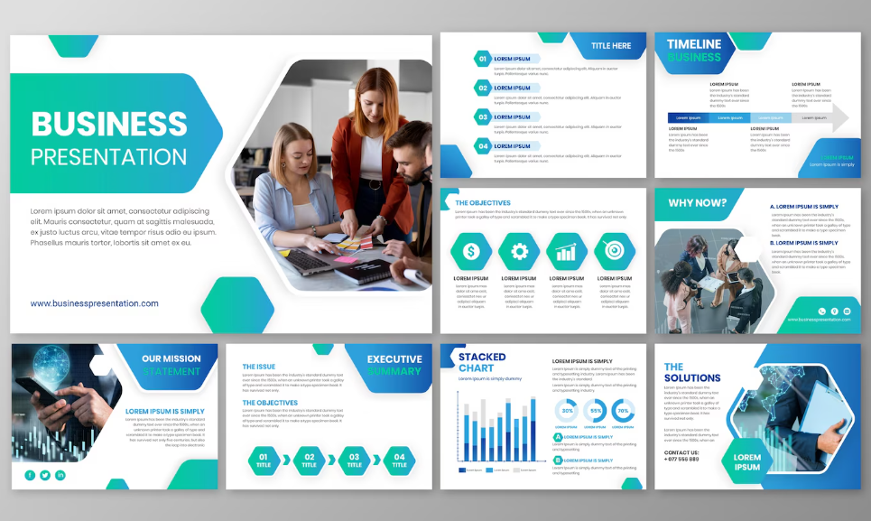
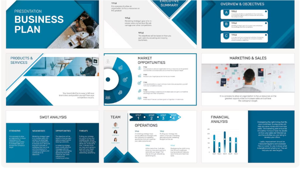
10 Secrets to Mastering Presentation Design for Maximum Impact

Presentations aren’t just about putting slides together—they’re about crafting an experience that captures attention and leaves a lasting impression. In today’s fast-paced world, people are bombarded with visuals, data, and information. That means presentation design has evolved far beyond basic bullet points on a dull background. It’s now about telling a story, connecting emotionally, and making your audience feel like they’ve just witnessed something worth remembering.
Whether someone is pitching a startup idea, delivering a business report, or teaching a workshop, great design can make the difference between applause and awkward silence. The art of presentation design blends creativity with strategy, ensuring that ideas are not just shared—but understood, remembered, and acted upon.
Why Presentation Design Matters More Than Ever
Think of presentation slides as the “visual voice” of a speaker. Even if the speech is flawless, poor design can distract and dilute the message. Conversely, thoughtful design works as a silent partner, amplifying the speaker’s words and creating emotional resonance. With attention spans shrinking, audiences need visuals that are not just pretty, but purposeful.
A well-designed presentation keeps the audience engaged, communicates complex information clearly, and gives the speaker credibility. It’s like dressing for an important meeting—the visuals need to match the message.
Step 1: Start with the Story
The best presentations don’t start with graphics—they start with a story. Every message should follow a narrative arc: a beginning that grabs attention, a middle that builds value, and an ending that leaves the audience inspired or ready to take action. This is where tools like Storyfiner can help by mapping out the flow before design begins. By clarifying the journey, designers avoid creating slides that feel random or disconnected.
When the audience feels the story unfolding, they’re more likely to stay emotionally invested. And let’s be honest—emotions drive memory.
Step 2: Design with Intent, Not Decoration
It’s tempting to fill slides with flashy animations, stock photos, and overly elaborate templates. But good presentation design isn’t about showing off; it’s about stripping away distractions so the message shines. Every color, font, and image should have a purpose.
If the topic is serious, bright neon graphics might not be the best fit. If the audience is international, cultural symbolism in colors and images should be considered. The goal is to make visuals that guide, not overwhelm.
Step 3: Master the Art of Simplicity
Minimalism in design is powerful. Instead of cramming ten bullet points on a single slide, aim for one big idea per slide. White space isn’t empty—it’s breathing room. This allows the audience to focus, rather than skim.
Data-heavy slides should be converted into simple, digestible visuals—charts, infographics, or icons that capture the essence without drowning people in numbers. A slide isn’t a script; it’s a cue card for both the presenter and the audience.
Step 4: Use Visual Hierarchy to Guide the Eye
Humans are visual creatures, and our eyes are naturally drawn to contrast, size, and placement. In presentation design, this is called visual hierarchy. Important headlines should stand out. Key statistics should be bold or in a different color. Supporting details can be smaller or placed lower on the slide.
This subtle guidance helps the audience follow the story without consciously realizing it. It’s like giving them a map without them knowing they’re holding one.
Step 5: Choose Fonts and Colors Wisely
Typography can communicate tone just as much as words do. A clean sans-serif font might feel modern and professional, while a hand-drawn script can feel playful or personal. Consistency is key—don’t mix five different fonts in one deck.
Colors set the mood. Warm tones might energize, while cool tones calm. Using a cohesive palette throughout the presentation makes it feel polished and intentional.

Step 6: Incorporate the Power of Imagery
Images should do more than decorate—they should illustrate and reinforce the message. A high-quality, relevant image can say more than a block of text. But avoid cliché stock photos that feel generic. Audiences can spot staged “smiling office people” a mile away.
Authenticity in imagery builds trust, while abstract visuals can spark curiosity and creative thinking.
Step 7: Balance Consistency and Surprise
A consistent design style helps audiences follow along without distraction. But sprinkling in a few unexpected visual elements can re-engage attention. This might be a bold color slide after a series of muted tones, or an animated transition after several static slides.
The trick is moderation—too much surprise and the audience feels scattered, too little and they might drift off.
Step 8: Practice Like the Slides Depend on It
Even the most beautiful slides can’t save a presentation if the delivery is shaky. Rehearsing with the final slides ensures smooth pacing and transitions. Knowing exactly when to click forward makes the talk feel effortless.
Practice also helps catch design flaws, like unreadable text or overly busy visuals that distract from key points.
Step 9: Optimize for Every Environment
A presentation that looks stunning on a laptop might look dull on a giant conference screen or get cut off on a webinar feed. Designers should always test their slides in the format they’ll be presented. This might mean increasing font size, adjusting colors for different lighting, or reducing file size for smoother online delivery.
Step 10: Keep the Audience in Mind—Always
At the heart of great Presentation Design is empathy. It’s about putting yourself in the audience’s shoes. What will grab their attention? What will help them understand the message faster? What will make them care?
It’s easy to design for oneself, but the real magic happens when the audience feels like the presentation was made just for them.
Conclusion
Presentation design isn’t just a skill—it’s an art form that blends communication, psychology, and aesthetics. The most memorable presentations are those where visuals and words dance together seamlessly, creating a performance that inspires action. And while tools and templates can help, the foundation always comes back to understanding the audience and telling a story worth hearing. For anyone looking to elevate their work, incorporating tools like Storyfiner can be the secret ingredient to making their next deck unforgettable. Above all, remember that great presentation design isn’t about the slides—it’s about the story they help tell.


