
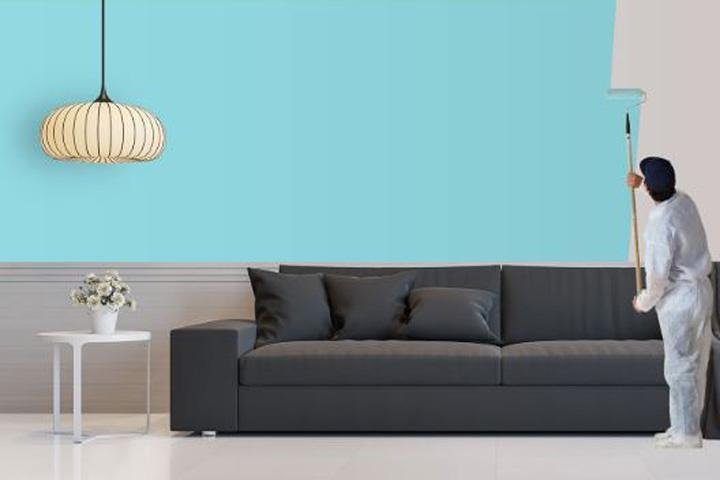
The colors we choose for our living spaces do far more than “look nice.” They act as a silent language, influencing our mood, energy levels, and even our physical comfort. When you hire an Interior Painting Service in Naples, FL, you aren’t just paying for a fresh coat of pigment; you are investing in an atmospheric shift for your sanctuary. Understanding the science behind these hues allows you to curate a home that feels exactly how you want it to—whether that’s a high-energy kitchen or a spa-like main suite.
The Emotional Language of Warm and Cool Tones
Color psychology generally divides the spectrum into two main categories: warm and cool. Choosing between them is the first step in defining the “soul” of a room.
The Energy of Warm Colors
Warm colors—reds, oranges, and yellows—are known to stimulate the senses.
- Red: Often used in dining rooms, red is thought to increase appetite and encourage conversation. It’s bold and passionate.
- Yellow: The color of sunshine, yellow evokes feelings of happiness and optimism. It’s a fantastic choice for kitchens or entryways to greet guests with a burst of cheer.
- Orange: A social color, orange creates a sense of playfulness. It’s ideal for home gyms or creative studios.
The Tranquility of Cool Colors
Cool colors—blues, greens, and purples—tend to have a calming effect.
- Blue: Widely regarded as the most relaxing color, blue can lower heart rates and promote focus. This makes it a top choice for bedrooms and home offices.
- Green: Combining the refreshing quality of blue with the cheer of yellow, green represents nature and renewal. It is incredibly easy on the eyes and works well in almost any room.
- Purple: Deep purples suggest luxury and creativity, while lighter shades like lavender are soothing and feminine.
Designing for Your Lifestyle in Southwest Florida
In a coastal environment like Naples, the external landscape often dictates internal choices. The bright Florida sun can wash out pale colors or make dark colors feel heavy. This is where a professional Interior Painting Service in Naples, FL, becomes invaluable. Experts like Fancy Painters understand how the local light interacts with specific undertones, ensuring that the “cool gray” you picked doesn’t end up looking like a muddy purple once the sun hits it.
Matching Color to Room Function
When planning your home renovation project, consider the primary activity of each space:
- The Bedroom: Stick to “receding” colors like soft blues, sages, or neutrals. These colors visually push walls back, creating an airy, peaceful environment conducive to sleep.
- The Living Room: This is often a communal space. Earthy tones or warm neutrals create a welcoming “hug” for guests.
- The Bathroom: To achieve that “luxury spa” feel, many homeowners opt for crisp whites or seafoam greens that mimic a clean, aquatic environment.
The Power of Neutrals and “Greige”
Neutrals are far from boring; they are the foundation of sophisticated interior design. Whites, beiges, and the ever-popular “greige” (a mix of gray and beige) offer a timeless appeal that adapts to changing furniture trends.
- White: Symbolizes purity and cleanliness. It reflects the most light, making small Florida condos feel much larger.
- Black/Dark Charcoal: While intimidating, using dark colors as an accent wall provides depth and drama, making the rest of the room’s colors “pop.”
- Beige and Tan: These provide a sense of stability and warmth without the intensity of brighter yellows.
Professional residential painters often suggest using different finishes (matte, eggshell, or satin) within the same neutral palette to add texture and visual interest without overwhelming the senses.
Enhancing Curb Appeal and Property Value
Beyond just your interior, the psychology of color extends to your home’s exterior and overall marketability. A well-executed house painting job can significantly increase your property’s value. Using a trusted brand like Fancy Painters ensures that the application is as high-quality as the color choice itself.
In the competitive real estate market, choosing “approachable” colors—those that evoke feelings of safety and freshness—can lead to faster sales. Buyers subconsciously gravitate toward homes that feel well-maintained and “calm,” a feeling directly influenced by the color palette.
Tips for Choosing Your Perfect Palette
If you’re feeling overwhelmed by swatches, keep these three tips in mind:
- Follow the 60-30-10 Rule: 60% of the room should be a dominant color (usually a neutral), 30% a secondary color, and 10% an accent color.
- Test in Different Light: Paint a large sample on the wall and watch how it changes from morning to night. The local painting experts in Naples will tell you that the 4:00 PM tropical sun is very different from morning light.
- Consider the Flow: Ensure there is a “thread” of color that connects your rooms, so the transition from the kitchen to the living room doesn’t feel jarring.
Final Thoughts
Color is one of the most cost-effective tools for transforming your quality of life. By understanding the psychological impact of your choices, you turn a simple chore into a strategic design move. Whether you are looking for a professional paint consultation or a full-scale room makeover, choosing the right shades will ensure your home is a true reflection of your personality and a sanctuary for your mind.